NEU, Rep Agency
A digital experience that communicates the studio’s work with greater clarity, confidence and personality.
The work became the interface
The most important content on the website is the work created by the talent NEU represents.
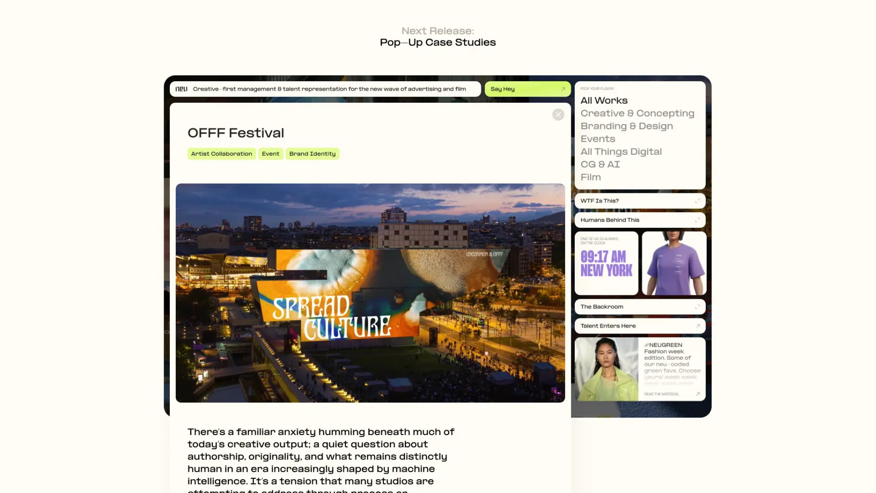
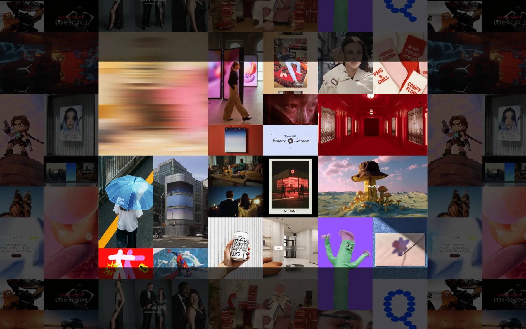
Instead of containing it within a conventional project grid, we made it the foundation of the interface. On desktop, the site is structured as an infinite canvas populated with projects, images, and moving content.
Visitors are free to navigate the work spatially rather than following a fixed order. This creates a more open and exploratory experience, while allowing the agency’s visual output to remain continuously present.
One continuous space
We wanted to avoid the fragmented navigation common to portfolio websites: opening a project, moving to a separate page, returning to the index, and repeating the same sequence.
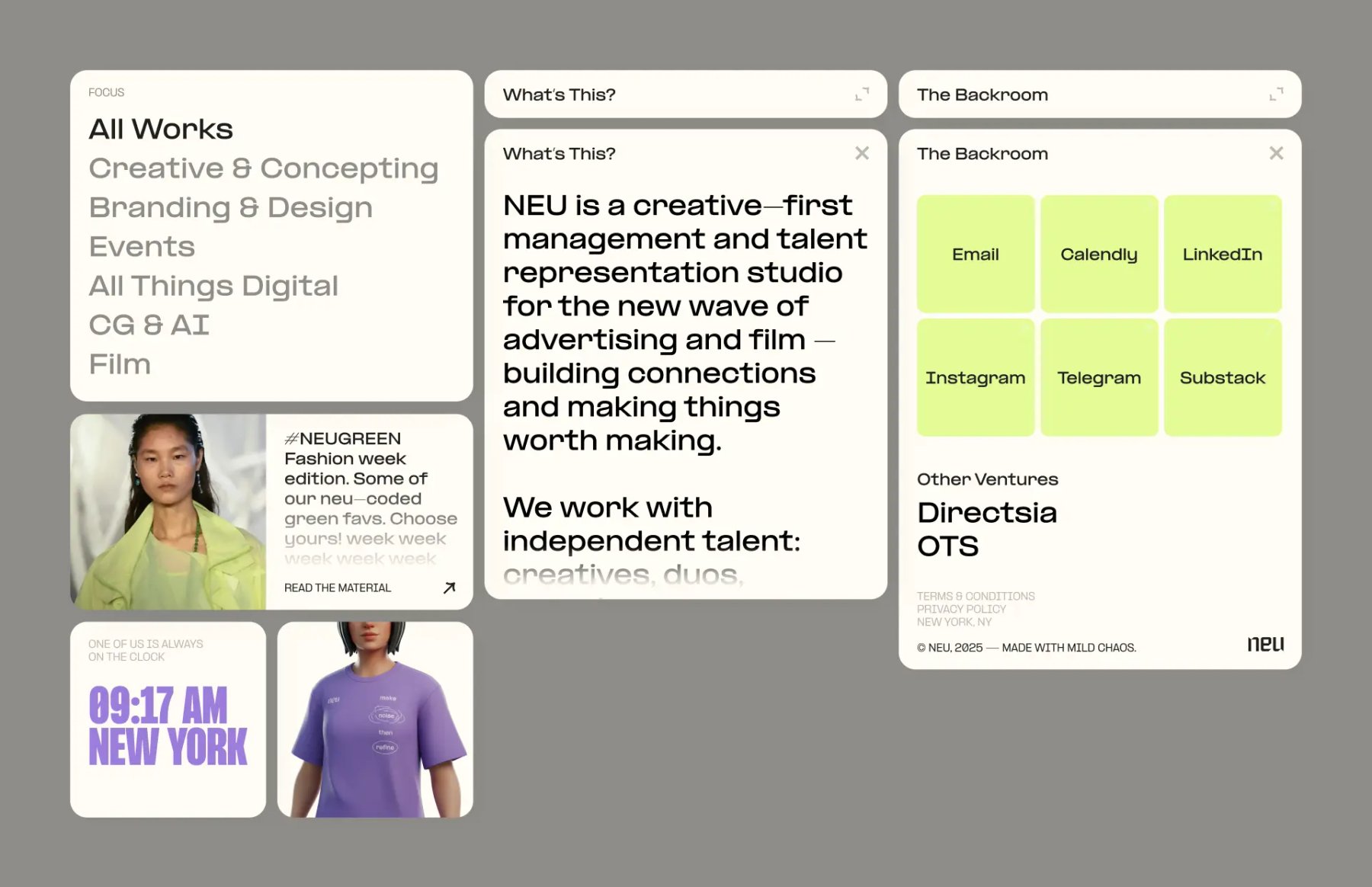
Neu.team was designed as a single-page experience. Information appears through a system of floating panels layered above the main canvas.
These panels contain project categories, agency information, team profiles, merchandise, time zones, and more playful pieces of content. Each layer can be accessed without leaving the underlying body of work.
This allowed the website to behave as one continuous environment rather than a collection of disconnected destinations.
Neither the infinite canvas nor the floating-window interface was entirely new as an interaction pattern.
The distinctive character of the website came from combining them into one system. The canvas created freedom and scale, while the panels provided structure, navigation, and context.
Together, they formed an interface that felt non-linear, active, and open—qualities that reflected both the agency and the talent it represents.
Designing for the device
We intentionally treated desktop and mobile as two separate interaction contexts rather than designing the desktop experience first and reducing it for smaller screens.
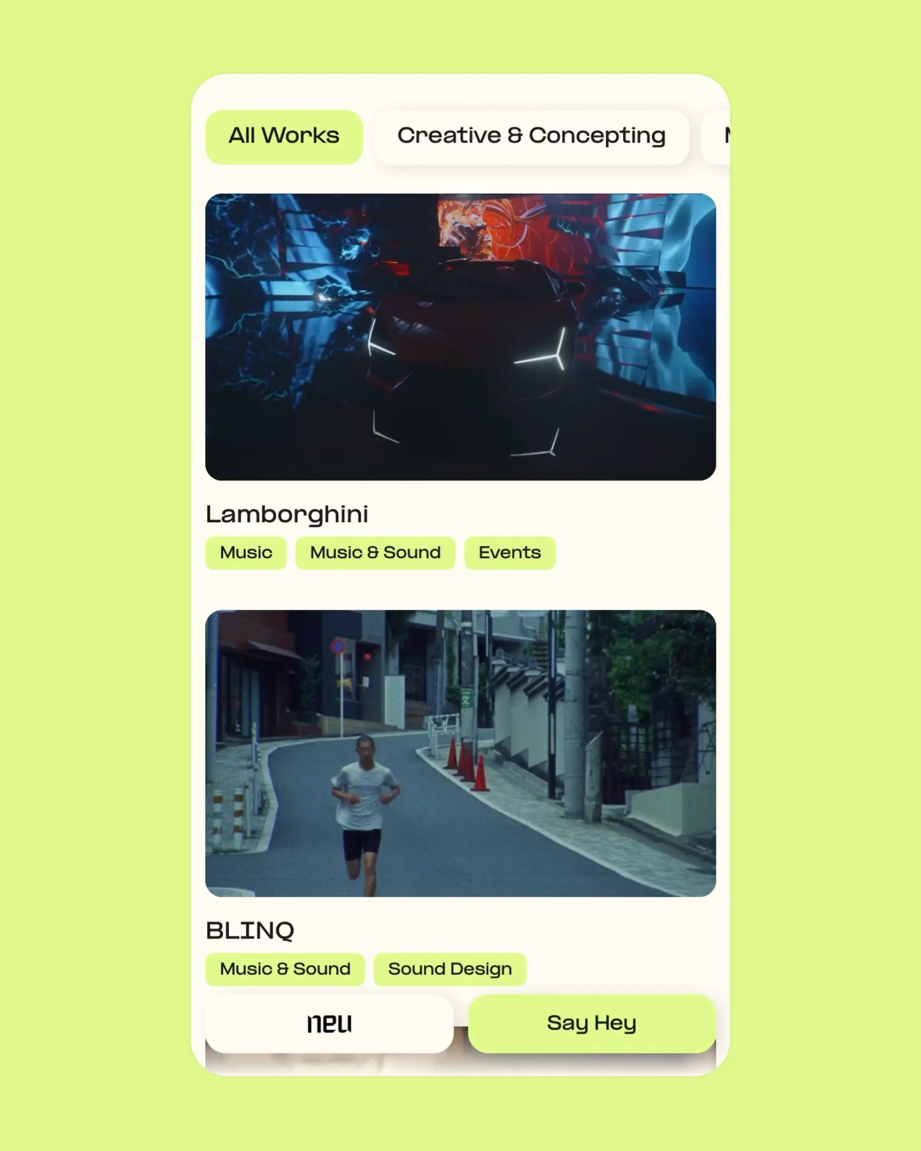
On mobile, the spatial canvas becomes a vertical feed. Projects can be browsed through a familiar scrolling behaviour, supported by categories and tags. The informational panels are consolidated into a menu that preserves the layered logic of the desktop interface in a form better suited to touch interaction.
The content remains consistent across devices, but the way it is experienced changes.
This became an important principle in my approach to digital design: responsive design should not only adapt dimensions. It should consider how behaviour, attention, and navigation change between devices.
A system designed to evolve
The website was never intended to be a static final object.
We continue to update it with new content, interactions, and interface layers, treating it as a living system that can evolve alongside the agency.
The original concept remains flexible because it is based on a small number of clear structural ideas. New features can be added without changing the fundamental logic or visual identity of the experience.